
ERIKA FURNITUREErika Furniture
Migration and redesign of a furniture website with a new identity, product content, and commercial path.
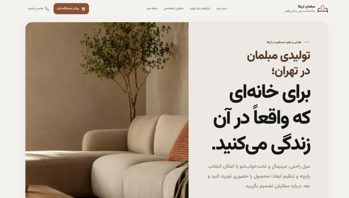
Image from the project’s public version, captured to document this case study.
How does the project work?
The four stages below show the product’s primary flow without exposing sensitive data or details.
- 01 / 04
Discovering a model
Users see models and each product’s use in the real context of a home.
- 02 / 04
Reviewing construction
Content explains direct purchase and the ability to review build quality.
- 03 / 04
Matching the space
Dimensions, everyday use, and the appropriate model enter the decision.
- 04 / 04
Visiting and ordering
Users reach a clear path to contact, in-person viewing, and delivery coordination.
Migration without carrying old problems forward
Moving a site is an opportunity to reconsider both content and its presentation model. The goal was not just to move a domain and its pages; the identity, product structure, and commercial path also needed to align with the brand’s current position.
In this process, what was worth retaining was separated out and pages were reorganized around the buyer’s real needs.
Furniture for real life, not catalogue imagery
The brand’s main message centers on a home that is actually lived in. That angle lets the model, comfort, sofa-bed function, and limits of home space become part of the product story.
Direct purchase from the manufacturer is presented not as a discount slogan, but as a chance to inspect construction and have a clearer conversation about an order.
Every model should answer a buying question
A product list is useful when the differences between models and their uses are clear. The new structure places models alongside explanations of function, style, and use context.
The content seeks to move the decision from “this photo is beautiful” to “is it right for my home and use?”
Warm space, decisive typography, and product at the center
The warm neutral palette lets imagery take the leading role. Large headings and asymmetric compositions distinguish the new identity from template stores.
Interface details were kept deliberately calm so product color and form do not compete with buttons and decoration.
From viewing to an in-person visit
For furniture, a final decision often requires touching, sitting, and checking dimensions. The site defines its role through preparing the user and directing them to a call or in-person visit.
Dimensions, model information, and the delivery process should be available before the conversation so the sales discussion starts from a more precise point.
A new identity with a clearer commercial path
The live website now presents the brand, models, direct purchase, and visit path in one coherent experience.
Sales data or conversion rate is not available for publication, and no numerical result has been added without business confirmation.
What was built within the project scope.
This list is based on project outputs that can be stated publicly—not speculative features or unverified technology.
- 01Website migration
- 02Identity redefinition
- 03Product architecture
- 04Commercial-content rewrite
- 05Responsive design
- 06Contact and visit path
- WEB MIGRATION
- BRAND REPOSITIONING
- PRODUCT CONTENT
- COMMERCE UX
Do you have a similar challenge?
If your project sits between web, operations, content, and automation, we can first clarify the problem and the shortest path to build it.
Start a conversation on Telegram